
Sunday, February 27, 2011
Monday, February 21, 2011

Sunday, February 20, 2011
Photoshop 08 Subaru Forester


After ^^^
- changed rim size
- changed ride hieght
- changed tint
- lost roof racks
- slight body angled drop
- changed badge colour
- smoother shadow
- edited guards to go flush with the drop n rim size
- cannon inserted


Poster evaluation
With this design, I think it could be massively improved, to me it still looks not professional.
I was happy with the result however overall considering my limited illustrator experience and by just designing this one poster i have already gained more skills through the program.
I think there is a bit to much negative space in this design but I think that could be a good thing also because of how busy the title is.
Overall I'm happy with it, but it will be good to see what advise Luke can give me about improving it and where i went wrong.

Monday, February 14, 2011


Sunday, February 13, 2011
Primary Principles of design in logos
Description:
in this logo the image is balanced, nearly equal part of negative and positive space. there is emphasis on the 6.0 to clearly show that this is a separate brand of Nike.
Hungry Jacks
Description:
This image is also balanced. The logo has emphasis on the text but show unity by both element coming together to create the image of burger that immediately tells the a person what they sell.

Monster Energy
Description:
Monster show major dominance on the green M. the green M is what people identify with the product. There is unity with the M and the text 'energy so people quickly see what type of drink it is. Variety is show by have a different font colour for the word Monster n bigger text so the products name is clear to consumers. the logo is more heavy at the top due to the big M so t is not balanced.

Description:
Like the Monster logo Von Zipper create emphasis on the 'VZ'. The yellow with black text n out line is the elements that create this emphasis. There is variety in this logo with the v and the z as well as the von and te zipper text being different boldness. This is not to create dominance but however to at interest to the design. A simple altercation in the text like in this logo allows for more interest and attractive
design.
Qantas
Description:
Qantas use diagonal in the logo to show movement, after all that is what there company does. The logo uses a kangaroo to show its Australian, and the kangaroo is in a position of movement which creates unity with the diagonal. Further unity is show through the Qantas text being italic also demonstrating movement, all these elements of the image come together to create an effective logo.
UNITY,VARIETY, HEIARCHY & DOMINANCE IN ADVERTS
NIKE 6.0 ad

Unity:
The advert uses the same colour being neutral white for the wording of the NIKE and the 6.0 logo for people to immediately realise the association between the brands
Variety:
the 6.0 logo and also he 6 in the web address
Zoo York advert

Unity:
The city scape plays with the company name 'ZOOYORK'. The colours work together.
Variety:
Shoe
Colony Bmx advert
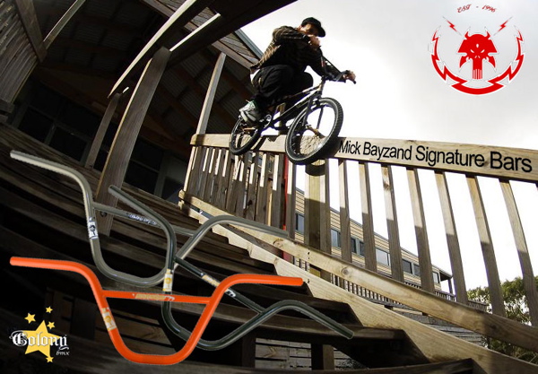
Unity:
-All the different available colours of those particular are the same size
-The image of the pro rider and his name on the bars suggest that they are the best because the best ride with the best components
Variety:
the bars are just on top of the image
Hierachy:
Rider

Unity:
The advert uses the same colour being neutral white for the wording of the NIKE and the 6.0 logo for people to immediately realise the association between the brands
Variety:
- using orange to high light ID. Most people that wear 6.0 apparel want it to stand out and give the individual an identity. Nike 6.0s shoes (the biggest part of this brand) can be fully custom with one's name printed on the back through to the material and the colours of the shoe.
- Different Font size especially the '6' in Nike6.com/ID possibly to further demonstrate that the 6.0 brand is separate from normal Nike products and also a emphasis
- Background is interesting, cant quite work out what i is, possible a shoe box butit is up to the readers own interpretation
- Logo
- The wording: NIKEID
- The Web address
- The background
the 6.0 logo and also he 6 in the web address
Zoo York advert
Unity:
The city scape plays with the company name 'ZOOYORK'. The colours work together.
Variety:
- Photos under the shoe
- spray painting effect of the text 'unbreakable'
- reflection
- shoes
- logo
- city scape
Shoe
Colony Bmx advert
Unity:
-All the different available colours of those particular are the same size
-The image of the pro rider and his name on the bars suggest that they are the best because the best ride with the best components
Variety:
the bars are just on top of the image
Hierachy:
- Rider
- Bars
- Text
- Colony logo
Rider
Tuesday, February 8, 2011
Real Fan of this guys art
http://sigurdseiersen.deviantart.com/
http://th09.deviantart.net/fs40/PRE/f/2009/029/4/6/Lollipop_Lick_by_SigurdSeiersen.jpg
http://th09.deviantart.net/fs40/PRE/f/2009/029/4/6/Lollipop_Lick_by_SigurdSeiersen.jpg
Key Points: Primary Principles affecting the internal relationships of a design
- Scale
- Emphasis
- Rhythm
- Movement
- Proximity
- Repetition
Key Points: Primary Principles affecting the design as a whole
- Unity
- Variety
- Hierarchy
- Dominance
- Proportion
- Balance
4 Key points What Good Design Does
-Attracts attention and arouse interest
-Seperate the particular message from the many other messages people recieve daily
-Make your message stronger, more effective and perhaps even memorable
-Save Money by acheiving maximum communication value from whatever resources are avalible
-Seperate the particular message from the many other messages people recieve daily
-Make your message stronger, more effective and perhaps even memorable
-Save Money by acheiving maximum communication value from whatever resources are avalible
Subscribe to:
Posts (Atom)