Unity:
The advert uses the same colour being neutral white for the wording of the NIKE and the 6.0 logo for people to immediately realise the association between the brands
Variety:
- using orange to high light ID. Most people that wear 6.0 apparel want it to stand out and give the individual an identity. Nike 6.0s shoes (the biggest part of this brand) can be fully custom with one's name printed on the back through to the material and the colours of the shoe.
- Different Font size especially the '6' in Nike6.com/ID possibly to further demonstrate that the 6.0 brand is separate from normal Nike products and also a emphasis
- Background is interesting, cant quite work out what i is, possible a shoe box butit is up to the readers own interpretation
- Logo
- The wording: NIKEID
- The Web address
- The background
the 6.0 logo and also he 6 in the web address
Zoo York advert
Unity:
The city scape plays with the company name 'ZOOYORK'. The colours work together.
Variety:
- Photos under the shoe
- spray painting effect of the text 'unbreakable'
- reflection
- shoes
- logo
- city scape
Shoe
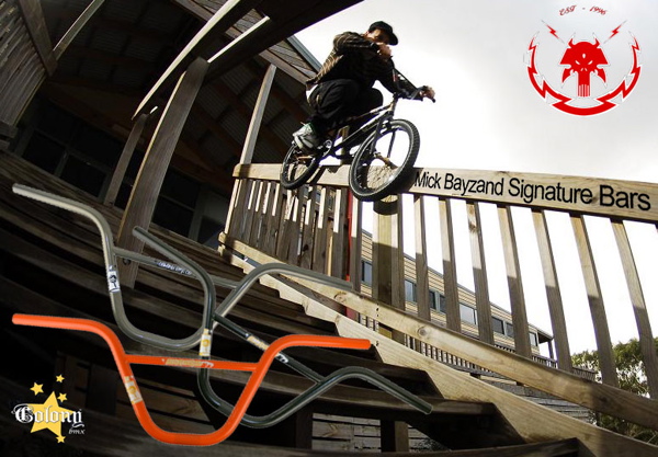
Colony Bmx advert
Unity:
-All the different available colours of those particular are the same size
-The image of the pro rider and his name on the bars suggest that they are the best because the best ride with the best components
Variety:
the bars are just on top of the image
Hierachy:
- Rider
- Bars
- Text
- Colony logo
Rider


No comments:
Post a Comment